A Bar Graph Chart is a simple and effective way to display and compare data using rectangular bars. Each bar represents a category, while its length or height shows the numerical value associated with that category. Because the differences between values can be seen visually, bar graphs are commonly used in classrooms, reports, surveys, presentations, and everyday data analysis.
Learning how to create and read a bar graph is an important basic data skill. A well-designed chart can turn a list of numbers into information that is much easier to understand. Students can use a bar graph worksheet to practice organizing data, choosing an appropriate scale, labeling categories, and interpreting results.
Whether you are creating a chart for a school assignment or simply learning how to present data clearly, understanding the basic parts of a bar graph will help you use this type of chart effectively.
What Is a Bar Graph Chart?
A Bar Graph Chart is a visual representation of categorical data. It uses rectangular bars to show the value of each category. The bars can be displayed vertically or horizontally, depending on the type of chart and the amount of information being presented.
For example, suppose a teacher asks five students about their favorite fruits. The results could be organized into categories such as apples, bananas, oranges, grapes, and strawberries. A bar graph could then show the number of students who selected each fruit.
The category with the highest number would have the tallest bar in a vertical bar graph. The category with the lowest number would have the shortest bar.
What Are the Parts of a Bar Graph?
Understanding the basic parts of a bar graph makes it easier to create and interpret one correctly.
Title
The title tells the reader what the chart is about. A good title should be short but specific enough to explain the data being displayed.
For example, Favorite Fruits of Students is more useful than simply calling a chart Chart.
Categories
Categories are the groups or items being compared. They are usually placed along the horizontal axis in a vertical bar graph.
Examples of categories include months, products, sports, school subjects, animals, or survey responses.
Values
Values represent the numerical amount associated with each category. They are typically displayed along the vertical axis in a vertical bar graph.
Axes
A bar graph normally has two axes. The horizontal axis identifies the categories, while the vertical axis shows numerical values.
Scale
The scale tells readers how the numerical values increase along an axis. For example, a chart might use increments of 1, 5, 10, or 20 depending on the data.
Bars
The bars visually represent the values. In a vertical bar graph, taller bars represent larger values. In a horizontal bar graph, longer bars represent larger values.
How Does a Bar Graph Work?
A bar graph works by converting numerical data into visual lengths or heights. Each category receives a bar, and the size of that bar corresponds to its value.
For example, imagine the following data:
- Apples: 8
- Bananas: 5
- Oranges: 10
- Grapes: 6
The orange category would have the tallest bar because its value is 10. The banana category would have the shortest bar because its value is 5.
This makes comparisons easier than looking at the numbers alone.
How to Create a Bar Graph Chart
Creating a Bar Graph Chart is straightforward when the data is organized before drawing the graph.
Step 1: Collect the Data
Start with the information you want to display. Make sure the data is accurate and organized into clear categories.
Step 2: Create a Data Table
Write each category and its corresponding value in a simple table. A data table helps prevent mistakes when transferring information to the graph.
Step 3: Choose the Axes
Decide which axis will contain the categories and which will contain the numerical values. For a typical vertical bar graph, categories go on the horizontal axis and values go on the vertical axis.
Step 4: Choose an Appropriate Scale
Look at the largest value in your data and select a scale that allows all of the bars to fit comfortably on the graph.
If the largest value is 50, for example, you might use a scale that increases by 5 or 10.
Step 5: Label the Axes
Clearly identify what each axis represents. Axis labels provide context and prevent readers from misunderstanding the chart.
Step 6: Draw the Bars
Create one bar for each category. Make sure the height or length of each bar matches its corresponding numerical value.
Step 7: Add a Title
Finish the graph with a descriptive title that explains what the data represents.
Vertical Bar Graph vs. Horizontal Bar Graph
Bar graphs can be presented in different orientations. The two most common forms are vertical and horizontal bar graphs.
Vertical Bar Graph
A vertical bar graph uses bars that extend upward from the horizontal axis. Categories are usually displayed along the bottom, while numerical values appear along the vertical axis.
Vertical bar graphs are useful when you want to compare a relatively small number of categories or display changes across categories such as months or years.
Horizontal Bar Graph
A horizontal bar graph uses bars that extend from left to right. Categories are usually displayed vertically along the left side, while numerical values appear along the horizontal axis.
Horizontal bar graphs can be especially useful when category names are long because they provide more room for labels.
When Should You Use a Bar Graph?
A bar graph is useful when you want to compare values among separate categories. It is particularly effective when the categories are distinct rather than representing continuous measurements.
Common examples include:
- Comparing survey responses
- Showing the number of students in different groups
- Comparing monthly sales
- Displaying product quantities
- Comparing test results
- Showing favorite activities
- Comparing populations across locations
- Displaying classroom data
Bar Graph Chart Examples
Bar graphs can be used to display many types of information. The important point is that each category should have a corresponding value that can be compared with the other categories.
Favorite School Subjects
A teacher could survey students about their favorite school subjects and use a bar graph to compare the number of students selecting math, science, English, history, and art.
Monthly Sales
A business could use a bar graph to compare the number of products sold during different months.
Weather Data
A classroom science activity could use a bar graph to compare rainfall totals or other recorded measurements across selected periods.
Survey Results
A survey can generate categorical data that is easy to display using bars. For example, respondents could select their preferred transportation method, with each transportation type represented as a category.
How to Read a Bar Graph Chart
Reading a Bar Graph Chart requires more than identifying the tallest bar. You should examine the title, labels, scale, and values before interpreting the information.
Read the Title
The title provides the context for the data. It tells you what the chart is measuring or comparing.
Check the Categories
Look at the category labels to understand what each bar represents.
Examine the Scale
Always check the numerical scale before estimating a value. A graph that increases by 10 at each mark should not be interpreted as if each mark represents 1.
Compare the Bars
Look for the highest, lowest, and similar values. Comparing bar lengths or heights can quickly reveal patterns in the data.
Look for Differences
You can calculate or estimate the difference between categories. This can help answer questions such as how much greater one value is than another.
What Can You Learn From a Bar Graph?
A well-designed bar graph can communicate several types of information quickly.
- Highest value: Identify the category with the largest bar.
- Lowest value: Identify the category with the smallest bar.
- Difference: Compare two or more values.
- Ranking: Arrange categories from highest to lowest.
- Patterns: Identify noticeable similarities or differences.
- Totals: Add values when the data and purpose make a total meaningful.
How to Use a Bar Graph Worksheet
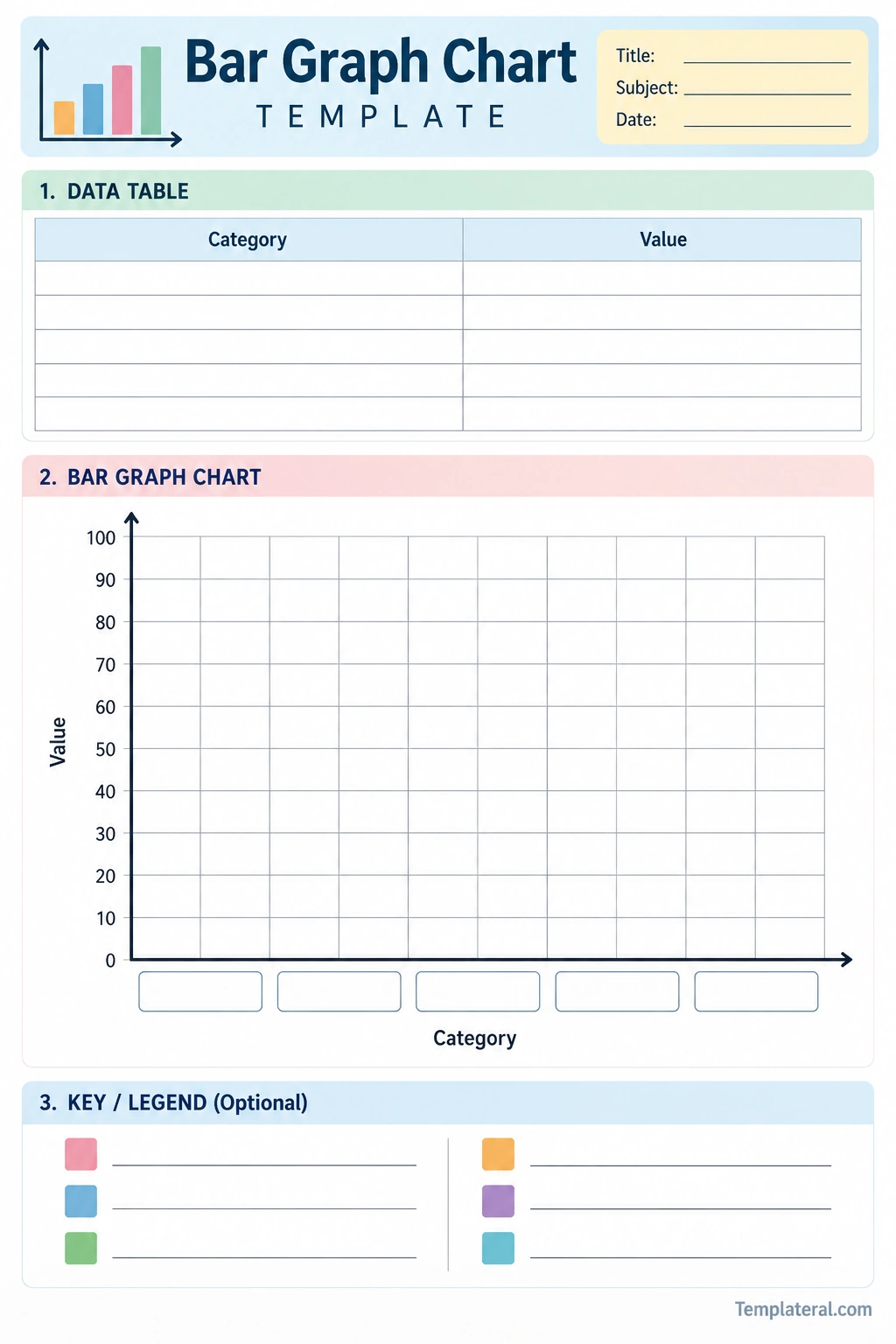
A bar graph worksheet can help students practice both creating and interpreting charts. A blank worksheet provides a structured space where students can enter categories, values, labels, and bars.
A useful bar graph worksheet may contain:
- A title section
- A data table
- A blank graph grid
- Category labels
- A numerical scale
- Labeled axes
- A legend when needed
- Questions for interpreting the completed graph
Students can first enter their data into the table and then transfer the values to the graph. This process reinforces the connection between numerical information and visual representation.
Tips for Making a Clear Bar Graph
Choose a Suitable Scale
The scale should make the data easy to read. Avoid a scale that is unnecessarily complicated or does not provide enough space for the largest value.
Use Consistent Bar Widths
Each bar should have approximately the same width. The value should be represented by the height or length of the bar rather than by changing its width.
Leave Space Between Bars
Small gaps between bars make individual categories easier to distinguish.
Label Everything Clearly
Include a descriptive title and clear axis labels. Readers should not have to guess what the numbers or categories represent.
Keep the Design Simple
A chart should communicate information rather than distract from it. Avoid unnecessary decorations, excessive colors, or complicated graphics.
Common Bar Graph Mistakes
Several common mistakes can make a bar graph difficult to understand or potentially misleading.
- Leaving out the chart title
- Failing to label the axes
- Using an inconsistent scale
- Skipping category labels
- Making bars different widths without a reason
- Leaving no space between categories
- Using a scale that does not include the largest value
- Starting the scale at an unusual value without clearly explaining it
- Using excessive decorative elements
Bar Graph Chart Activities for Students
Teachers can use bar graph activities to help students practice collecting, organizing, and interpreting data.
Classroom Survey
Ask students a simple question, such as their favorite fruit, sport, or school subject. Record the responses and create a class bar graph.
Data Collection Activity
Students can collect data about objects in the classroom, such as the number of different types of books, supplies, or colors represented in a collection.
Graph Interpretation Questions
After completing a chart, ask questions about the highest value, lowest value, differences between categories, and overall patterns.
Create Your Own Dataset
Once students understand the basic process, have them create a small dataset and design their own bar graph from it.
Bar Graph Chart vs. Other Types of Graphs
Different types of graphs are designed for different types of data. Choosing the right chart can make information easier to understand.
Bar Graph
A bar graph is commonly used to compare values among separate categories.
Line Graph
A line graph is often used to show changes or trends over an ordered interval, such as time.
Pie Chart
A pie chart displays parts of a whole and is useful when the focus is on proportions or percentages.
Histogram
A histogram displays the distribution of numerical data grouped into intervals. Unlike a typical categorical bar graph, the bars in a histogram generally touch because the intervals represent continuous ranges.
Frequently Asked Questions About Bar Graph Charts
What is a Bar Graph Chart?
A Bar Graph Chart is a visual representation of data that uses rectangular bars to compare numerical values across categories.
What are the main parts of a bar graph?
The main parts include the title, categories, numerical values, horizontal and vertical axes, scale, labels, and bars. Some charts may also include a legend.
What is the difference between a bar graph and a line graph?
A bar graph is generally used to compare separate categories, while a line graph is commonly used to show changes or trends across an ordered sequence such as time.
How do you make a bar graph?
Collect and organize the data, identify the categories and values, choose a suitable scale, label the axes, draw a bar for each category, and add a descriptive title.
What is a bar graph worksheet?
A bar graph worksheet is a printable or digital activity sheet that provides space for students to organize data, construct bar graphs, and practice interpreting chart information.
Why is a bar graph useful?
A bar graph makes it easier to compare numerical values across categories. Differences, rankings, highest values, and lowest values can often be identified quickly by looking at the bars.
Conclusion
A Bar Graph Chart provides a simple way to turn numerical information into an easy-to-read visual comparison. By using categories, values, axes, labels, a clear scale, and consistently sized bars, you can create a chart that communicates information effectively.
Whether you are teaching students, completing a school assignment, organizing survey results, or presenting data, understanding how to create and interpret bar graphs is a useful skill. A printable Bar Graph Chart Template can make the process easier by providing a ready-to-use structure for entering data and building the graph.
With regular practice, students can move from reading simple charts to creating their own graphs and using visual data to answer questions, identify patterns, and make meaningful comparisons.
Download: Bar Graph Chart Template
